DEVELOPR STUDIO.
your idea could be the next big thing on the internet.

User Driven. Technology Enabled.
We design experiences that build trust.
we're passionate about making your brand look amazing. We do this by focusing on what really matters: user experience. our process starts with the user as we work our way back to the technology, not the other way around.
Design is not just what it looks like and feels like. Design is how it works.
-Steve Jobs
OUR DESIGN PROCESS
aspects like branding, design, usability, and function are all included in the concept of user experience, which covers the full process of acquiring and integrating a product. The narrative starts even before the user even takes possession of the device.
1. RESEARCH
2. WIREFRAMING + USER TESTING
3. DESIGN + UX + FUNCTIONALITY
4. INTEGRATION + USER TESTING
5. DESIGN ITERATION + analytics
DYNAMIC DESIGN. USER DRIVEN.
design needs to adapt to the user at every step and not the other way around.
INTUITIVE DESIGN.
intuitive design does not mean easy and straightforward. knowing when no design is the best design takes intuition. the best designed products are the ones you don't need a user manual to use.
OUR PORTFOLIO.
The NEXT GEN FITNESS APP.
FITUP.
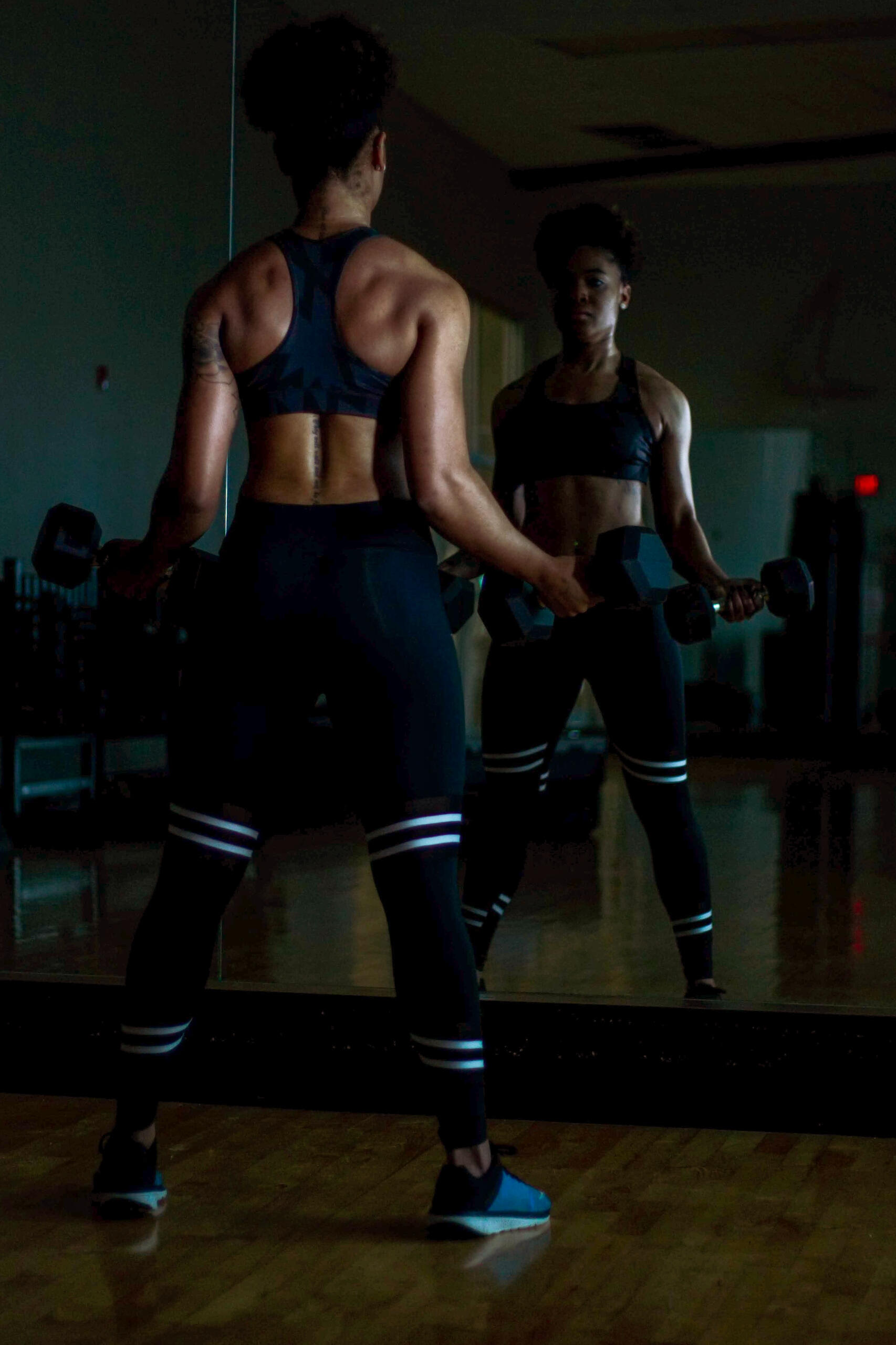
fitup is a fitness membership platform where we offer immersive bite-sized fitness training videos professionally created and curated by certified fitness trainers.
SALES_AUTOMATION
AEVAA.
aevaa is a conversational avatar that sits on the digital doorstep. brands can now have a direct dialogue with users.
A_ TALENT_NETWORK
SOCIALIME.
a branding agency that connects you to prevetted talent to help manage your social media. with socialime hire only the best with zero overhead cost.
RETROSTYLE_ECOMMERCE
RETROVYBE.
a concept ecommerce store that features retro-style merch inspired by the 80's. this is still in the works:-)
WORK WITH US.
© Developr Studio, LLC. All rights reserved.
FITUP.
BACKGROUND AND MOTIVATION
Hiring a fitness trainer is expensive and not a great option for those just starting out or those that have hectic schedules and don't have time to commit making it a major hurdle to even get started.
Traditional fitness courses and apps are either too structured or not engaging enough. As a result, many people give up on their fitness goals and become frustrated with their progress.
After the course or workout plan is completed those who started don't follow through to continue with their fitness journey after the completion of their set workout plan losing their progress and not reaching their desired physique.
THE MISSION
The main mission for fitup was to create the most immersive fitness training experience on the market through bite-sized fitness training videos curated and professionally filmed by certified fitness trainers with a library of over 150 workout videos all while being reasonably priced, promoting the progress of setting long term fitness goals while following through with them.
WIREFRAMES + DESIGN
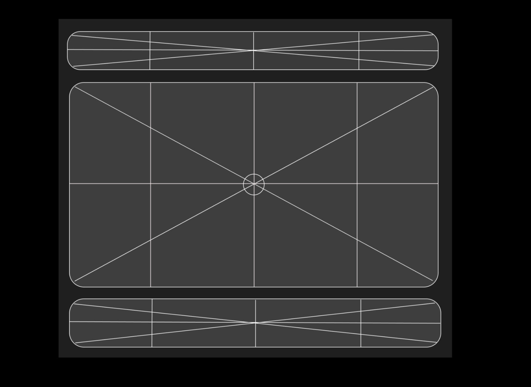
The first thing we did was create a simple, uncluttered design that allowed users to focus on their workout without distractions. We also wanted to make sure the app matched the aesthetic of our brand and website.
We started by creating a wireframe, which is a visual guide that shows how each page will look before it’s built. We used this as a guide for how we would build each screen in the app so we could make sure everything matched our vision.
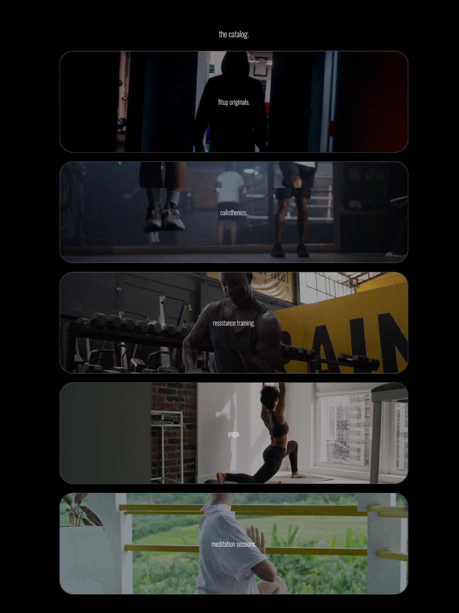
We wanted to make sure that users could easily find what they were looking for, so we organized all of our workouts by workout genre making the whole search process a streamlined experience.
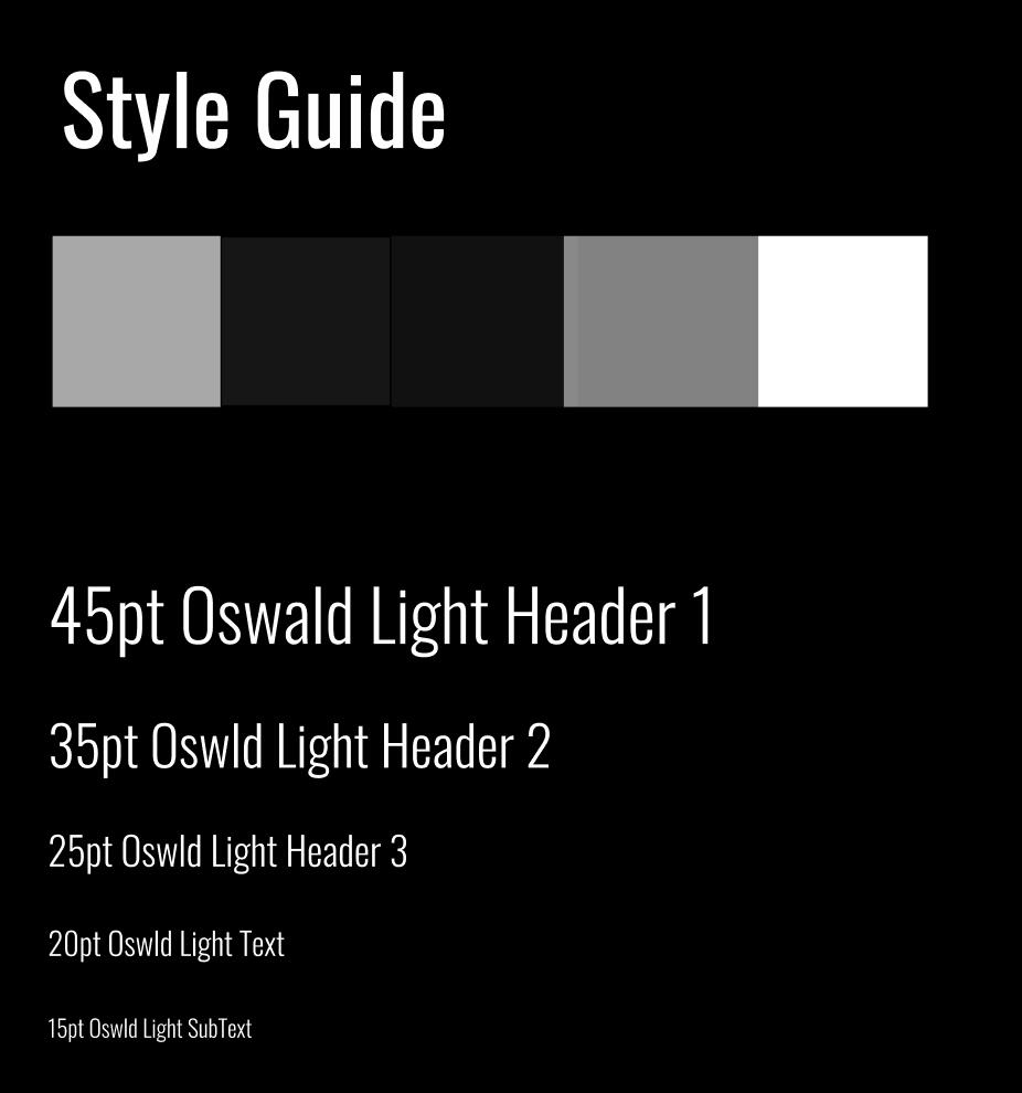
We used the Oswald font for a more modern sporty look for the platform and used the dark scale to place more emphasis on the visuals and video content throughout the platform.
We eventually decided that we should try something different than what most other fitness companies are doing in terms of design. Instead of using typical UX patterns like tabs or hamburger menus, we wanted to create an experience that felt more like a digital magazine than just another website.
IMPACT + OUTCOME
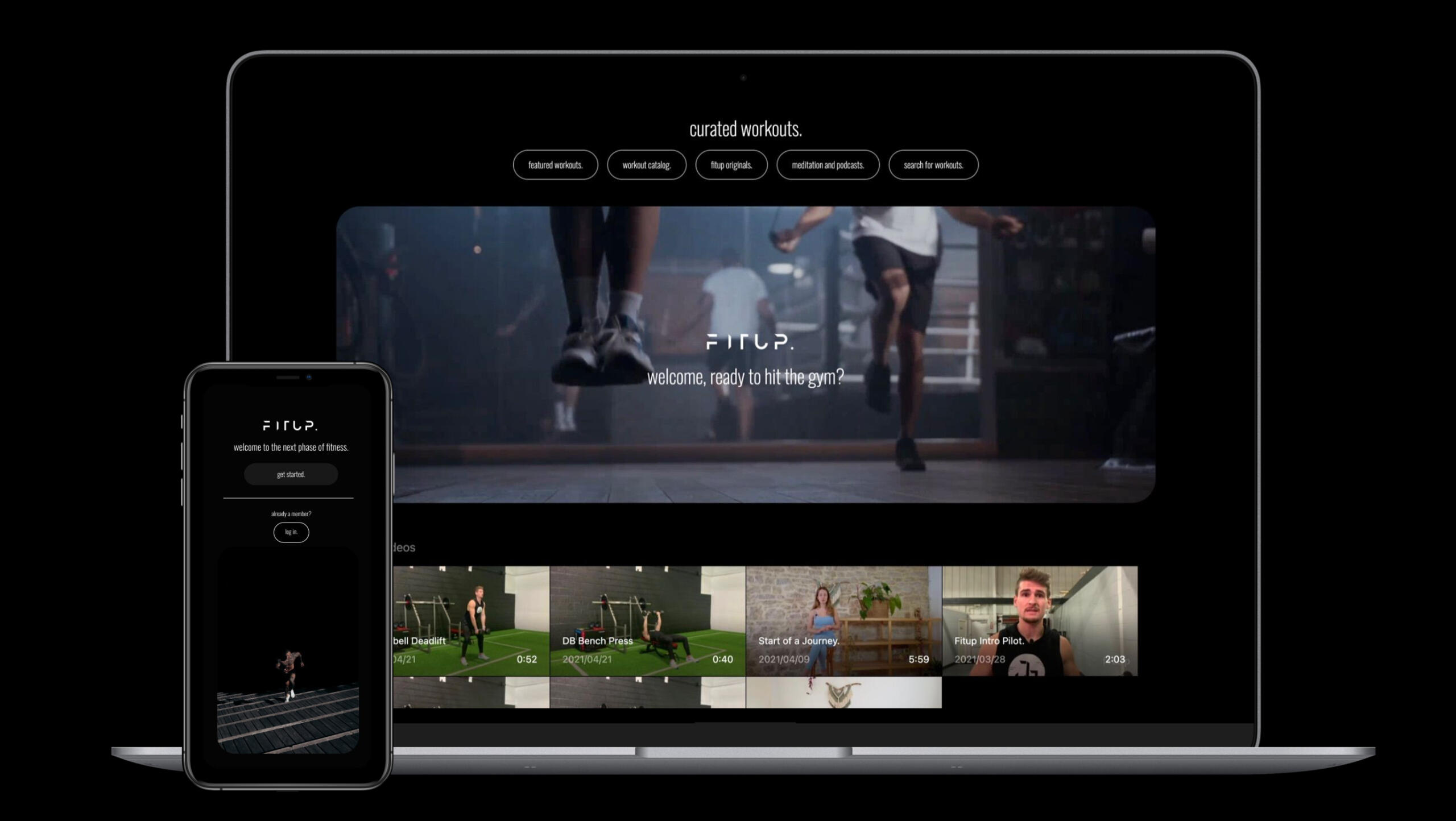
The design for the platform is built on a core philosophy of simplicity and clarity. We've created a simple, easy to use interface that's beautiful and engaging on all screen sizes.
The goal was to create something that would allow users to easily navigate and find what they're looking for much faster than before by minimizing the number of taps needed to get to where they need to get when trying to find a certain workout.
The result of branching off from traditional UX patterns resulted in a more interactive mode of engaging with the platform and a more cohesive user experience that was easy to navigate, but also allowed the user to have a sense of ownership over what they were doing within the app itself.
THE NEXT_GEN DESIGN AGENCY.
DEVELOPR STUDIO.
Thanks, we got your message! A member of our team will reach out to you.